

CALLOUT RESEARCH TIPS PART 3: IT’S NOT ABOUT BURN, IT’S ABOUT BALANCE
by Thomas Giger of www.radioiloveit.com
Burn could be (mainly) caused by your Disloyal Cume — not your P1 audience. It’s worth including cross tab checks in your callout research analysis.
Following part 1 (about recruiting panels) and part 2 (about conducting surveys) of our specialist series on callout research, here’s the final instalment about this proven method for music testing of currents & recurrents. This part 3 explains how to interpret results of callout research to play the right music for your target audience. Over to guest author and radio researcher Stephen Ryan!
A LIGHT INTEREST IN A SONG CAN AFFECT WHAT WE SEE IN A CHART

There’s a high number of streams vs. a small amount of sales & downloads (image: Ryan Research)
OPTIMISE YOUR SONG EXPOSURE
In previous articles in this series, we discussed how callout research is used to get an ongoing trend indicator for the lifecycle of a song, from its initial exposure to its peak rating and then its eventual decline in popularity rating (normally through ‘burn’ where listeners are getting tired of it). The trends help you decide on your category allocations based on the hierarchy of songs tested, from the highest to the lowest rating.
CONSIDER RADIO’S UNIQUE ATTRIBUTES
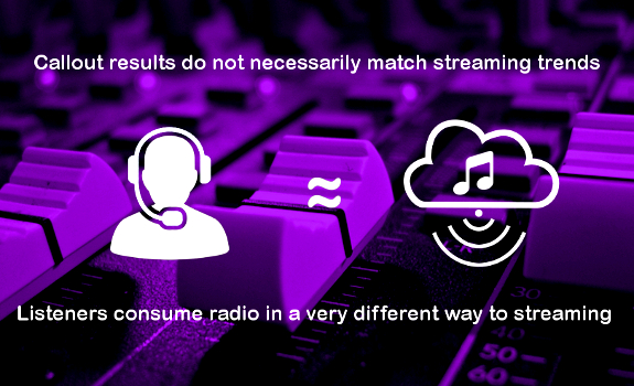
Before we look at the subject of analysis, there is one question that crops up on a regular basis. Clients will often enquire why the results of callout research may differ from those of streaming statistics and local charts. The results in callout for certain top streamed songs may not indicate the same level of interest. It is important to remember that listeners consume radio in a very different way to streaming. More importantly, the methodology used to calculate those results is considerably different.
UNDERSTAND MUSIC CHART METHODOLOGY
The Official Charts Company in the UK includes sales, digital downloads and streaming statistics. While sales and digital downloads involve some effort on behalf of the consumer, an audio stream only has to be played for 30 seconds in order to be included. While 150 streams now count as the equivalent of 1 ‘sale’ of a song, when streams are counted in the millions there is in fact a chance that what is actually a light interest in a song by a reasonably large number of consumers can affect what we see in a chart (even if only 10 plays are counted per individual user, per day).
A SINGLE INDEX SCORE HELPS TO SPREAD OUT THE DIFFERENCES

Find the slightly better songs in similar rated cluster (image: Thomas Giger, 123RF / ruslanshug)
INCREASE YOUR STATION’S TSL
On radio, we want to ensure that listeners return and remain loyal, and that we maintain a good Time Spent Listening. We are looking for songs that will retain people’s interest and attention for a lot longer than 30 seconds. Proprietary callout research provides a greater insight into what your listeners really want to hear. Downloads and streams can be good indicators, but that interest needs to be qualified within your own environment: your songs; your listeners.
SCHEDULE YOUR CALLOUTS CONSISTENTLY
In part 1, we’ve seen how the increasing cost of participant recruitment for CATI-based research has driven a tendency to move from a traditional 44 waves to 26 waves of callout research per year, so with results received on alternative weeks. If your format leans on current and recurrent songs, such as CHR or Hot AC, you need to have a high enough and very regular frequency of waves for desired trend consistency. If you can only afford to do a wave every few months, then the movements in song ratings may be highly erratic, and the benefit of doing callout in the first place will be diluted. Reliable callout trends require regular waves and data updates.
ZOOM IN ON DIFFERENCES
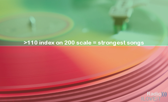
In part 2, we’ve shown how to use a Popularity and Potential Index to provide a single metric to identify a hit or potential hit. Using a single index score also helps you spread out the differences in the song ratings. Here, if there is a cluster of similar ratings for songs, the index can help to discover the slightly better songs. On a 200 index, a score or potential score of over 110 identifies the strongest songs. To analyse the results, you need to sort order the list of tested songs from the highest to the lowest popularity. However, you also need to look at the trends for each individual song to ensure the results are not a one off spike or a trough (excessive bouncing in the results).
KEEP YOUR ATTENTION FOCUSED ON THE KEY METRICS

Compare all other cross tabs to that your Music Core ‘anchor’ cross tab (image: Ryan Research)
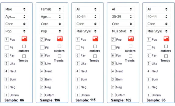
COMPARE BETWEEN CROSS TABS
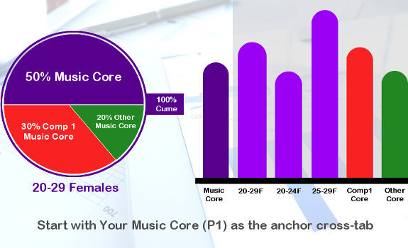
If you have acquired a sample with the specific quotas of 100% Cume (your station), built from 50% Music Core (your P1 listeners) vs. 50% Competitor(s) Music Core (your competition’s P1 listeners, also known as your Disloyal Cume), then you need to run cross tabs for each, and cross compare. That allows you to check on any potential polarity in the results. As explained in a previous article, for any cross tab to be reliable, you need a minimum sample of 30 people in each.
USE A SPECIFIC ORDER
Your Music Core are respondents who listen to you most, and generate your highest TSL. They are most exposed to your music, and are more acutely aware of your rotations. For this reason, you want to use Music Core as your anchor, and compare all other cross tabs to that one Music Core cross tab. Next, you should run your Total cross tab (for example: 20-29 Females), followed by your Competitor(s) Music Core cross tab. This is, of course, a minimum process for cross comparison where you have a single gender sample.
LOOK AT ESSENTIAL DATA
If you have data from females and males (and as long as there is a minimum sample of 30 people in each additional cross tab), you may break out each of the Totals by Gender, and split the Total age demo into its constituent parts (in this example: 20-24 and 25-29). While each additional cross tab provides extra information, you want to avoid the dreaded ‘analysis paralysis’ where you are trying to absorb too much data. Instead, keep your attention focused on the key metrics, and focus primarily on your Music Core (as they are your most important listeners).
BOUNCING IS ACCEPTABLE, WITHIN REASONABLE MARGINS

For hit songs at their peak, up to 15% or 20% popularity variance is normal (image: Ryan Research)
SATISFY P1’S, BUILD CUME
Your want to base your strategy and approach on two levels when analysing your data:
- You want to keep your most loyal listeners happy and engaged
- You want to see if you can convert those who currently sample you on a weekly basis, but still listen to your competitor(s) most of the time, to listen to you more, as long as that doesn’t interfere with point 1!
ACCEPT MINIMAL POPULARITY BOUNCES
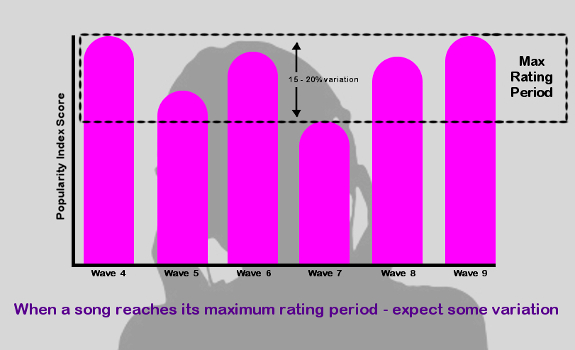
Ideally, when looking at any cross tab, you’d like to see an even trend from the start of each song’s lifecycle through to its peak rating, and then on to its decline in popularity. In reality, you can expect some bouncing in a song’s rating across its life cycle, even during its peak period. A minimal amount of bouncing is acceptable, if it’s within reasonable margins. Over the course of a number of waves where a song is at its peak rating period, if you see a variance of up to 15% or even 20% in its Popularity index, then this should not cause too much alarm.
BEWARE OF UNNATURAL FLUCTUATIONS
What you don’t want to see is a song being a hit in one wave, and then get a mediocre score (let alone a poor rating) in the next wave. While the speed of increase and decrease may vary from song to song, there should be an element of a gradual increase to its peak and then a gradual decline as it Burns. Very occasionally, you will see a song maintain its hit status for a very long period of time, after which it will suddenly fall off the cliff with a rapid increase in Burn, but this is unusual. If you begin to see bounces in song ratings above and beyond 20% (when songs are at their peak), then you need to review the panel and recruitment criteria with your fieldwork company.
THERE ARE TWO SCHOOLS OF THOUGHT

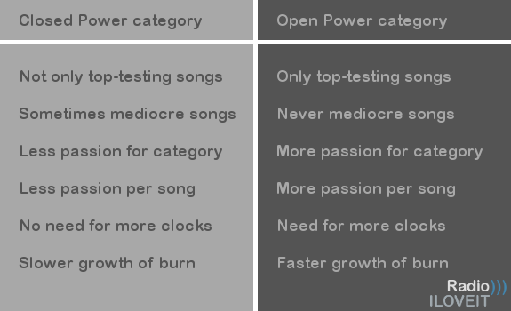
You can work with either a fixed or a flexible number of songs in your Power Current category, knowing that each option has its own benefits versus disadvantages (image: Thomas Giger)
CHECK RATING CUT-OFF POINTS
In a 30-song test list, when ordered from highest to lowest popularity, you would ideally want to see the strongest songs at the top, and then a gradual decline in popularity scores as you go down the list. The songs in the middle to lower part of your list would be those which are either new and in their ascendency, or previous hits in their decline. In more recent times, the spread of songs from the highest to lowest popularity tends to be not so evenly spread. A small group of songs at the top of the list may elicit really good popularity scores, and then there is a drop to more mediocre scores. This can lead to a dilemma in terms of category allocation and rotation of your best-testing songs.
CONSIDER USING FLEXIBLE CATEGORIES
There are two schools of thought. You either have a fixed number of slots in your Power Current category, which must be filled following the results of each wave of research. For example, your A category must always have 5 songs, so you take your 5 best-testing songs in your list and insert those in the category. They are then evenly rotated throughout the day. However, what happens if 3 top songs in your research have phenomenal scores, while the other 2 have reasonably good scores? Here, not all songs are equal. The other school of thought is therefore to allow your A category to be dynamic — and if there are only 3 phenomenal songs, then only put those in Power.
MIND YOUR BURN SCORES
The decision on the right course of action has to be a purely pragmatic one, and will differ on a case by case basis. Whirlwind rotations of the 3 phenomenal songs means the listener is exposed to their most favourite songs more often. On the other hand, such high rotations will likely lead to a faster Burn on these 3 songs, and to a never ending quest to find equally powerful replacement songs as their popularity wanes. However, while using a fixed number of songs in your A category may ease the development of Burn, depending on the scores for the additional 2 songs (in our example) it will dilute the average passion for the songs in the Power category.
BE A LITTLE BIT MORE TOLERANT OF BURN LEVELS

Compare a song’s Burn rate with its Favourite and overall Popularity scores (image: Ryan Research)
FIND YOUR POTENTIAL SECONDARIES
The songs in the mid to lower part of the list need to be judged on different criteria depending on whether they are new songs in potential ascendancy, or previous hits in decline. For those newer, upcoming songs, the power of the Potential index comes into its own. As a reminder, the Potential index is similar to the Popularity score, except it tries to forecast the Popularity score, if the current Unfamiliarity rating was removed and apportioned pro rata to the existing Favourite, Like & Neutral scores. While the current Popularity index may be only mediocre, the Potential index helps you identify songs from your middle list part for your secondary (B) or, if you have one, tertiary (C) category.
BEWARE OF HIGH UNFAMILIARITY
One word of caution. While you may have made every effort to avoid unfamiliar songs in your test list, always check the Unfamiliar rating for each of these B (or C) category candidates. If the Unfamiliar score is higher than around 20%, then the Potential score becomes less reliable, because there are too few people in the sample for the current Favourite, Like & Neutral metrics for this song. Small samples lead to erratic results! Most songs in the middle part of the list have often been tested in previous waves, so check how the Potential index has trended so far (and if it makes sense).
INVESTIGATE >20% BURN RATES
For previous hits in decline, that decrease in rating will be primarily driven by one metric — Burn. As a song’s Burn starts to develop (and Popularity begins to fade), you may have decided to move it from a top-level current category straight to Power Recurrent. However, once it hits a certain level of Burn, consider resting the song (at least for a while, after which you can re-test it). Traditionally, once a song hit 20% Burn, it was deemed time to rest it. In recent times, it’s necessary to be a little bit more tolerant of Burn levels. It is always a question of balance, and the Burn rating always needs to be compared with the Favourite rating (and the overall Popularity score).
EVERY SAMPLE HAS POSSIBLE OUTLIERS IN IT

Proprietary analysis tools help remove anomalies in music research data (image: Ryan Research)
FOCUS ON P1 LISTENERS
For example, a song could have a Burn of 24%, but a Favourite of 32% and a Popularity score of 118 (on a 200 index). Depending on what other songs you have available, you may wish to retain this one in rotation longer, and accept the current Burn level. Again, it has to be a pragmatic decision. Also, carefully cross check the Burn on the song for your Music Core against the Total, and against your Competitor(s) Music Core. You may find that the high Burn score is mainly driven by your Disloyal Cume, and therefore in fact would be lower for your Music Core.
CONSIDER APPLYING SPECIALIST SOFTWARE
To efficiently analyse the research data, you’ll need some form of analysis tool to generate the song ratings. If you work with a consultant, you’ll likely have access to professional analysis & reporting software. When you are adept at using spreadsheet software such as Excel, including its inbuilt functions and formulas, you could analyse the data yourself. The one thing to keep in mind is that, regardless of the efforts of the fieldwork company to provide samples and data based on your agreed quotas, every sample has possible outliers in it. These can skew the end results.
CHECK POSSIBLE DATA ANOMALIES
Using proprietary analysis software gives you access to calculations and algorithms to help you identify and remove outliers from your sample. If your test results are consistently erratic, even after a review with your fieldwork company, then you may consider to remove anomalies using the sophistication of a proprietary analysis tool, such as iRate.
This is a guest post by Stephen Ryan of Ryan Research for Radio))) ILOVEIT. iRate is a product of Ryan Research.
Please fill out this form and we’ll reach out right away to schedule your demo.